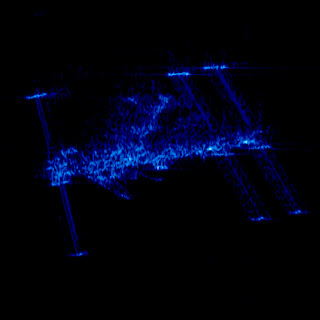
Pretty Picture: ISS in the X-band - The Planetary Society Blog | The Planetary Society
This spooky-looking image is the international space station as taken by a radar satellite, the German TerraSAR-X.
I actually worked with these radar satellites, though they are now my natural enemies. The basic way they work is very clever, and with appropriate analysis, you can extract things like tiny movements of glaciers from the data.
The basic problem with radar is that the wavelength is quite long. This satellite uses X-band, roughly 10 GHz, so its wavelength is about 3 cm. (Okay, this is well above what we use to observe most pulsars, but radar sources in the sky are still offensive in principle.) Anyway, if you have a satellite in orbit — say 500 km away from the ground — and you want 1 m resolution, diffraction means you need an antenna something like 15 km long. This is obviously not easy to arrange in a satellite, so how do these satellites work?
The trick is that this is radar, where they illuminate their targets themselves. So to get resolution in the across-track direction — measurements of how far something is from the satellite — they can use the return time of the pulse. Resolution in this direction is not affected by diffraction; it is instead set by the length of the pulse. (In fact, you can do better: you send a longish pseudo-randomly modulated pulse, then do an FFT correlation between the return and the pseudo-random sequence. This lets you save on peak power, and also be blind to pulses that you didn't generate.)
It is in the along-track direction that these satellites are really clever. The trick they use is that the objects they're taking images of reflect radar in exactly the same way every time, not just in amplitude, but in phase as well. So while you don't have a 15 km antenna, or array of antennas, you can simply fire off one pulse, record the returns, move forward, fire off another, record the returns, and so on. You can then combine those 15 km worth of pulses as if they were fired off simultaneously and you had receivers spread over the whole 15 km, and get nice high along-track resolution. From a signal-processing point of view, what you measure, for a fixed across-track distance, is the terrain reflectivity (in phase and brightness) convolved with your antenna's real beam — including a phase term that is quite sensitive to along-track position. Deconvolution by such a tractable kernel is just a question of running a matched filter over the data.
What you get out of this process is a nice clean image of the terrain you flew over. For each pixel, you have a radar reflectivity (possibly in several polarizations) and a phase. Radar reflectivity depends on many things, just like visible-light reflectivity does; angle of the surface, roughness, composition, what have you. So interpreting the results requires some care, as does interpreting aerial photographs, but basically you can see differences in ground cover and composition. Human artifacts are often very easy to spot, since flat faces tend to be very dark unless they're aligned exactly right to reflect directly back, while right-angle corners serve as retroreflectors and tend to always look bright.
There's an aspect of the data that I have so far ignored, though: what about the phase of the returns? Well, if all you have is one image, there's just not that much information there. The phase says something unclear about the distance modulo 1.5 cm of the "center of reflection" of the pixel. Not much use to it. But if you have two images, well, now things get interesting.
 If the two images were taken simultaneously but from slightly different positions (we had an aircraft that did this), the phase difference between the two images would tell you about the altitude of the land: higher altitude would be slightly closer to the top antenna than lower altitudes, and since we were looking at centimeter-scale differences, we had great altitude resolution. (We beat the diffraction limit here because there was only one signal per along-track and across-track position; if we'd had more than one return, distinguishing them would have been impossible.)
If the two images were taken from the same position but at different times, things become even more interesting. Remember I said the phase was related to the distance of the "center of reflection" of the pixel? Well, if the terrain has moved rigidly, that center of reflection will also have moved, so the phase will have changed. And the sensitivity to position is in fractions of a centimeter! So, for example, we had data sets of a glacier in which I could see how many centimeters the snow and ice had flowed over the intervening weeks. There was a beautiful picture on the cover of Nature around then of a volcano in Japan which had been imaged before and after a minor outgassing, and it was visible where and how much the volcano had shrunk as the gases escaped. It's fantastic stuff.
My own part in all this was fairly minor (I was a first-year undergraduate at the time); I shuffled data from tape to disk and processed it, and I worked on the semi-manual "phase unwrapping" process. This process is necessary because all the information based on phase is wrapped by 2 pi, so that for X-band a shift of 1.5 cm looks identical to a shift of 3 cm or zero. But in normal images the distortion is similar in nearby pixels, so you can write code that looks for nearly-two-pi jumps and removes them. This mostly works, but there is of course noise in the data, so it's not quite so simple. We had algorithms that mostly worked, and I worked on correcting their output and trying to improve the way they ran. (The tool that did it was a nightmarish 100k single file of C code written by someone no longer around, so this took... patience. People have since found better ways to address the problem.) The results you can see to the left, a mosaic digital elevation model (color indicates altitude) of Bathurst Island I assembled (for more information see here, though the page title wrongly implies it was taken from space). The mosaicing code I wrote was not great, but the dark vertical lines in the image are not really my fault: since the image is made from several long "strips" from separate tracks flown by the aircraft, the angle of illumination of the terrain changes when you go from one strip to the next, so the reflectivity changes in an unpredictable way. I saw some ground-level pictures of Bathurst Island at the time, and it's pretty desolate - "ground cover" means "lichen", pretty much, even in summer.
We also found that while we had great data sets, it was sometimes challenging to present them in ways the geologists found useful. They were used to topographical maps with contour lines, while we were producing images with rainbow fringes. So I worked on surface smoothing, 3D rendering (on old pre-OpenGL SGIs), and stereograms as well. I never did manage the trick of seeing separate-image stereograms without a viewer, though some of my coworkers did.
Anyway, the spooky-looking image of the ISS is just a cute side benefit of the very interesting things you can do with radar satellites.
I actually worked with these radar satellites, though they are now my natural enemies. The basic way they work is very clever, and with appropriate analysis, you can extract things like tiny movements of glaciers from the data.
The basic problem with radar is that the wavelength is quite long. This satellite uses X-band, roughly 10 GHz, so its wavelength is about 3 cm. (Okay, this is well above what we use to observe most pulsars, but radar sources in the sky are still offensive in principle.) Anyway, if you have a satellite in orbit — say 500 km away from the ground — and you want 1 m resolution, diffraction means you need an antenna something like 15 km long. This is obviously not easy to arrange in a satellite, so how do these satellites work?
The trick is that this is radar, where they illuminate their targets themselves. So to get resolution in the across-track direction — measurements of how far something is from the satellite — they can use the return time of the pulse. Resolution in this direction is not affected by diffraction; it is instead set by the length of the pulse. (In fact, you can do better: you send a longish pseudo-randomly modulated pulse, then do an FFT correlation between the return and the pseudo-random sequence. This lets you save on peak power, and also be blind to pulses that you didn't generate.)
It is in the along-track direction that these satellites are really clever. The trick they use is that the objects they're taking images of reflect radar in exactly the same way every time, not just in amplitude, but in phase as well. So while you don't have a 15 km antenna, or array of antennas, you can simply fire off one pulse, record the returns, move forward, fire off another, record the returns, and so on. You can then combine those 15 km worth of pulses as if they were fired off simultaneously and you had receivers spread over the whole 15 km, and get nice high along-track resolution. From a signal-processing point of view, what you measure, for a fixed across-track distance, is the terrain reflectivity (in phase and brightness) convolved with your antenna's real beam — including a phase term that is quite sensitive to along-track position. Deconvolution by such a tractable kernel is just a question of running a matched filter over the data.
What you get out of this process is a nice clean image of the terrain you flew over. For each pixel, you have a radar reflectivity (possibly in several polarizations) and a phase. Radar reflectivity depends on many things, just like visible-light reflectivity does; angle of the surface, roughness, composition, what have you. So interpreting the results requires some care, as does interpreting aerial photographs, but basically you can see differences in ground cover and composition. Human artifacts are often very easy to spot, since flat faces tend to be very dark unless they're aligned exactly right to reflect directly back, while right-angle corners serve as retroreflectors and tend to always look bright.
There's an aspect of the data that I have so far ignored, though: what about the phase of the returns? Well, if all you have is one image, there's just not that much information there. The phase says something unclear about the distance modulo 1.5 cm of the "center of reflection" of the pixel. Not much use to it. But if you have two images, well, now things get interesting.

If the two images were taken from the same position but at different times, things become even more interesting. Remember I said the phase was related to the distance of the "center of reflection" of the pixel? Well, if the terrain has moved rigidly, that center of reflection will also have moved, so the phase will have changed. And the sensitivity to position is in fractions of a centimeter! So, for example, we had data sets of a glacier in which I could see how many centimeters the snow and ice had flowed over the intervening weeks. There was a beautiful picture on the cover of Nature around then of a volcano in Japan which had been imaged before and after a minor outgassing, and it was visible where and how much the volcano had shrunk as the gases escaped. It's fantastic stuff.
My own part in all this was fairly minor (I was a first-year undergraduate at the time); I shuffled data from tape to disk and processed it, and I worked on the semi-manual "phase unwrapping" process. This process is necessary because all the information based on phase is wrapped by 2 pi, so that for X-band a shift of 1.5 cm looks identical to a shift of 3 cm or zero. But in normal images the distortion is similar in nearby pixels, so you can write code that looks for nearly-two-pi jumps and removes them. This mostly works, but there is of course noise in the data, so it's not quite so simple. We had algorithms that mostly worked, and I worked on correcting their output and trying to improve the way they ran. (The tool that did it was a nightmarish 100k single file of C code written by someone no longer around, so this took... patience. People have since found better ways to address the problem.) The results you can see to the left, a mosaic digital elevation model (color indicates altitude) of Bathurst Island I assembled (for more information see here, though the page title wrongly implies it was taken from space). The mosaicing code I wrote was not great, but the dark vertical lines in the image are not really my fault: since the image is made from several long "strips" from separate tracks flown by the aircraft, the angle of illumination of the terrain changes when you go from one strip to the next, so the reflectivity changes in an unpredictable way. I saw some ground-level pictures of Bathurst Island at the time, and it's pretty desolate - "ground cover" means "lichen", pretty much, even in summer.
We also found that while we had great data sets, it was sometimes challenging to present them in ways the geologists found useful. They were used to topographical maps with contour lines, while we were producing images with rainbow fringes. So I worked on surface smoothing, 3D rendering (on old pre-OpenGL SGIs), and stereograms as well. I never did manage the trick of seeing separate-image stereograms without a viewer, though some of my coworkers did.
Anyway, the spooky-looking image of the ISS is just a cute side benefit of the very interesting things you can do with radar satellites.


No comments:
Post a Comment